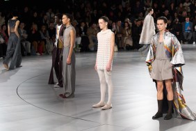
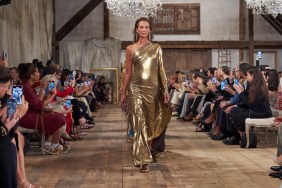
Known for using digital prints to emphasize form and structure, Michael Angel strayed somewhat from his signature aesthetic this season. Although the Spring/Summer 2011 collection still incorporated the beautiful digital kaleidoscope of colors, this time Angel chose to use layers and texture to create shape and silhouette. In this collection, Angel’s minimalist approach only succeeded partially. The strategically placed, digital color graduations that emphasized feminine curves were missing.

Angel’s more masculine approach to the feminine look this season was counterbalanced by sequined tops and skirts with very high slits. Overall, the look failed to have the aimed effect at times, though this different approach at combining the masculine with the feminine worked in some garments.

What did work in this collection was Angel’s experimentation with texture. Latex layered over printed sarong skirts and men’s midriff-baring collared tops nicely highlighted how a variety of textures and shapes can give a dramatic effect on the runway. However, the redundancy of Angel’s masculine shirts flattened what could have been an effective marriage of the masculine and the feminine.


