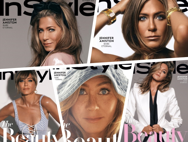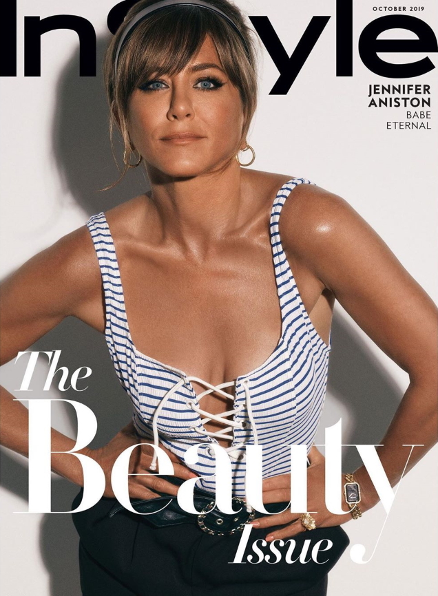
Our forum members immediately began picking favorites. “I actually love these a lot, Jen looks gorgeous and healthy as usual. And it all works well for InStyle‘s brand,” declared dodencebt.
“This is so good,” praised caioherrero.
“Fabulous to see Michael Thompson shooting the cover of InStyle, I am loving the look of each and every cover here. For me, the second is all we needed — love the styling on Jennifer, the taupe tones, the monochromatic masthead and fonts. Also very much into the Veruschka cover!” vogue28 chimed in.
[ Not a tFS forum member yet? Click here to join! ]
“The first two covers are gorgeous! Wow, what a tan!” voiced Srdjan.
But a certain something bothered the majority of our members. “Holy bronze! I like the third cover, looks great. But the tan ruins everything. I get that she’s the eternal Cali beach babe, but wow. That’s awful. Anyway, way too many covers as usual. And the styling looks very pedestrian,” critiqued Benn98.
“These covers already look dated,” mocked ellastica.
“They managed to make one of the most beautiful women alive look subpar,” stated RMDV.
HeatherAnne wasn’t much of a fan, either. “I was excited that she was on the cover, but the styling here is beyond embarrassing, they styled her like she’s Lauren Conrad. So juvenile and goofy.”
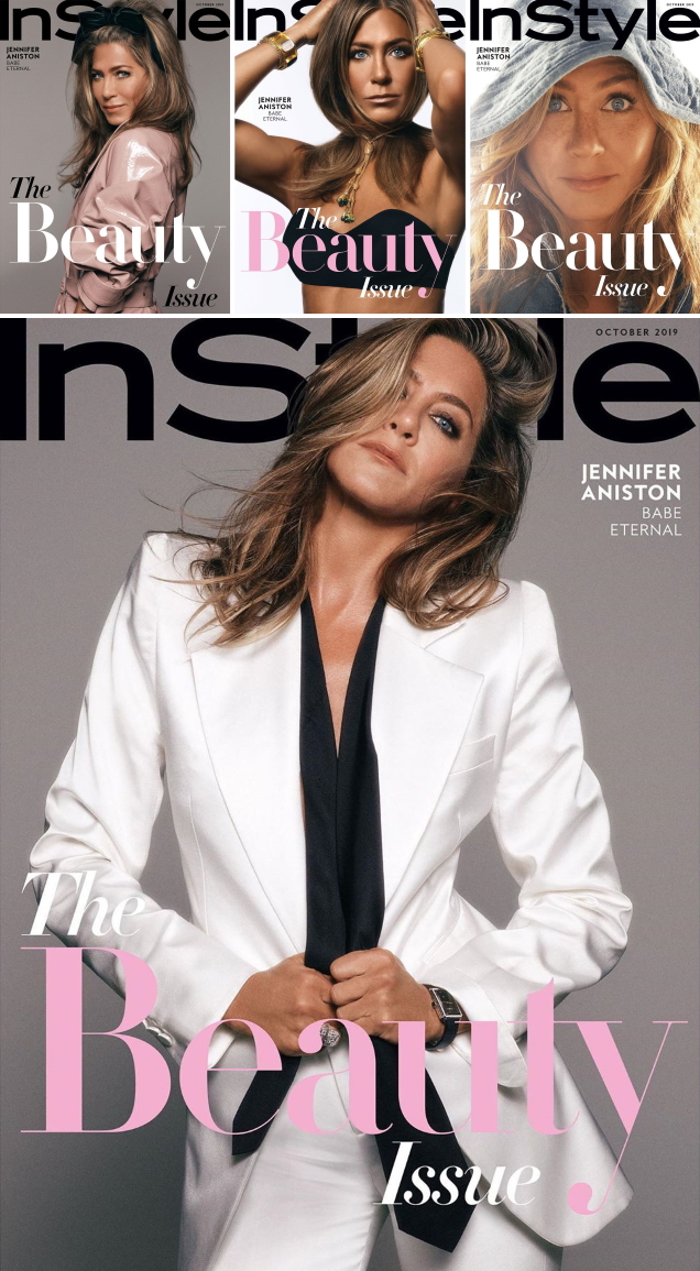
Which cover will you be hunting down? Sound off and share your thoughts here.
