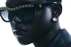
Arizona Muse was destined to star in Chanel’s Spring 2017 advertising campaign after having opened the show during Paris Fashion Week. Thankfully, there are no signs of collage, cut and paste, or bold Photoshop madness like last season’s mess, though that doesn’t guarantee a step up for the new campaign. Karl Lagerfeld captured Arizona against a plain studio backdrop, allowing Carine Roitfeld’s loud styling do all the talking — maybe a little too much talking.

IMAGE: FACEBOOK.COM/CHANEL
Our forum members were quick to ignite debate. “Not surprised by how much I don’t like this but I can’t get over the hairstyle with those wanna-be Bantu knots. They should know better – missed opportunities all around,” fumed an underwhelmed miyakestan420.
“I love Arizona but this concept is wrong for her. It’s an awful campaign, entirely Karl’s fault. He doesn’t know what he’s doing,” raged anlabe32.
Kokobombon also panned the campaign, saying, “So boring IMO. Just a white background and silly styling? I’d take last season over this any day of the week!”
Lola701 wasn’t a fan of Roitfeld’s styling either. “Carine, you got some explaining to do… WHAT IS THAT? As much as I love Carine, I have to admit that her collaboration with Chanel has been the most disappointing thing ever. I’ll not blame Karl on this one because, let’s be honest, the photography and the composition are actually beyond simple,” she pointed out.
“WTF is that? My problem with Carine is that since her departure from Vogue Paris, she has tried so much to be young and edgy when she is the master of provocation and sexiness. Honestly, Chanel needs to shake up their campaigns,” said a disapproving GivenchyAddict.
“Chanel is oldish and trying to be young, not succeeding here,” Nymphaea echoed.

IMAGE: FACEBOOK.COM/CHANEL

IMAGE: FACEBOOK.COM/CHANEL
See more images from Chanel’s Spring 2017 advertising campaign and add your own two cents here.


