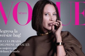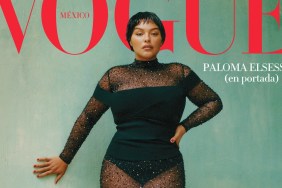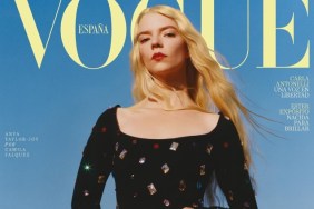
IMAGE: FACEBOOK.COM/VOGUEMEXICO
Vogue Mexico clearly selected the wrong shot for the cover, however. “I like the second one it’s a beautiful portrait but the rest is so lifeless! And the styling is so boring,” wrote a dissatisfied narcya the second the cover broke.
“I like the second shot (below left) the most. The first (above) could have been great but her expression kinda ruins it IMO,” slated sixtdaily.
Also favoring one of the fold-out photos was MON: “The second shot should have been the sole cover. The others are borderline boring and catalogue. The layout.. Vogue Australia 2009?”
“The second cover is the best for me.The first and the third ones are too lifeless and bland. Taylor looks asleep. How many times are they going to give that “iconos de hoy” cover line? I feel like they are doing that every month,” pointed out Aizanara.
“I quite like the third image too (below right). The coat is great shaping, the expression and the soft dress together, has more of a contrast and fashionable vibe than the other two,” favored gius, just as things started to shape up.
GlamVal was a little lost for words, writing, “I can’t believe this is Vogue Mexico. I love those covers!”
Expressing the same attitude was TeeVanity: “These are lovely, especially fond of the black and white image.”

IMAGES: FACEBOOK.COM/VOGUEMEXICO
See Taylor’s accompanying cover story and join the debate here.


