IMAGE: GOTCELEB.COM
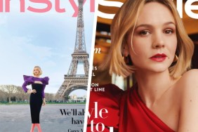
Forum members weren’t afraid to call out InStyle on this horror of a cover. “That shot does not do her any justice at all! She’s a gorgeous woman, and this…” questioned a less than impressed MON, ranting the moment the cover came to light.
“Ouch. What a bad shot of her!” complained an appalled honeycombchild.
In agreement over how terrible the shoot turned out was Benn98, chiming in, “Didn’t know it was possible to take a bad shot of her, but alas. Cannot get past the unkempt hair. I am however very mad about the masthead colour scheme.”
Forum member fluxxx wasn’t much of an admirer either, pointing out, “I thought that was a Nylon cover. The headline under her name is also something that you would see on Nylon, not InStyle.”
We’ll keep a firm hold of our copies of the American edition while the British version sorts itself out. Add your own two cents on Chloë’s cover here.


