IMAGE: VOGUE.CO.UK
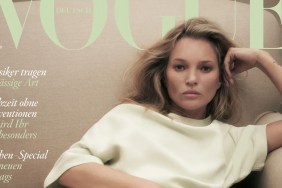
“It amazes me that they always find something to write about Kate Moss,” complained an underwhelmed WilliamsLe010919 the moment the cover dropped.
TaylorBinque wasn’t exactly jumping up and down either: “Kate Moss on Vogue U.K.’s cover, groundbreaking! At least they can push it a bit. It’s like they are not even trying.”
In the same frame of mind was KateTheGreatest. “Very boring, I feel like I’ve seen this before… Also I’m tired of Kate, she doesn’t bring anything new to the table anymore.”
Sharing the same underwhelming sentiments was Benn98: “God, this is so bland! Like it was done in such a haste. The empty space above her head is bothering me because it’s not the style of British Vogue.”
“Probably the longest it’s been without her getting a cover. Same old, same old. Blah, blah, blah. The editing on her face too, regardless of how good a model Kate may be/once was, I know fine well that’s not how she looks now. Perhaps it’s the quality of the image, but that’s some serious post-production work on her face there,” chimed in honeycombchild.
Also noticing signs of post-production was dfl-001: “Completely booooooring. If not for Photoshop, she would not be working these days.”
Ouch! Better luck next time British Vogue. Stay tuned for the content, but in the meantime, join the conversation here.


