IMAGE: ELLEUK.COM
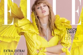
Members of our forums shared mixed views toward the cover, however. “I like it, it’s really striking. I bet it’s gonna stand out on the newsstands!” enthused Nepenthes at once.
“Most certainly the best cover they have done in years, for me. Everything works here, she looks great, and all that text layout doesn’t take away when you have such a strong image. Well done, I’m surprised,” contributed an amazed Miss Dalloway.
In agreement over how nice the cover turned out was Psylocke, replying, “I concur. I think this is a fantastic cover and I love everything about it.”
But not everyone was left pleasantly surprised. “Probably the profile will center around her business ventures? Stunning and striking shot. There was no need for the signature though, it’s too illegible and clashes with the jacket,” Benn98 pointed out.
“It’s OK to have some free space, ELLE! What a way to ruin the cover with the signature. But otherwise I like it, it’s catchy,” reasoned kokobombon.
“The text is illegible against such a strong image, but that somehow doesn’t matter. If only they could make such striking covers most of the time,” fired back tigerrouge.
Forum member burbuja8910 most certainly wasn’t feeling it, stating: “Bland cover. Let’s hope that the subscriber’s cover and editorial will be better.”
Await the content and add your own two cents here.


