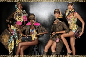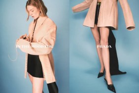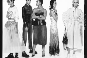
IMAGE: PRADA.COM
The images went down as a treat. “Love the art direction, coupled with the set design and photography. This is reminiscent of Meisel’s mid-noughties Prada ads, which is no bad thing. Yasmin looks quite gorgeous here and I’m into the fact that the whole ad looks like it will veer in a more classic direction than the runway show,” applauded Fiercification straight away.
“Wow this is such a strong shot. Could’ve easily been a Vogue Italia cover. Plus, the model is so stunning! Hopefully, Meisel will take her under his wing!” shared an equally impressed Nepenthes.
In agreement over how beautiful the campaign turned out was jeffandtheworld, adding, “She looks elegant and expensive. Love the clean hair and makeup styling against all that mess from the collection. Good casting!”
“Beautiful shot! I was expecting something more loud, I’ll wait to see more to make judgement, but this definitely feels more sophisticated and directly targeted to the Prada woman,” admired a more than satisfied jescajade.
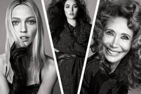
Discussion only became louder once Sasha’s shot dropped (below left). “That image alone saves the whole campaign. I don’t care about anything else, Sasha is back in Prada. Love the dreamy pose & expression and the art deco set,” raved kokobombon.
“Wait, wait, wait. Shut the front door and enter through the back! Sasha snuck into Prada and is such a pleasant surprise. The perfect muse for this house,” echoed Aedlacir.

IMAGES: PRADA.COM
Don’t forget about Natalia (above right)! See more from the campaign and drop us a comment here.


