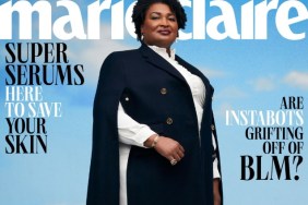
IMAGE: MARIECLAIRE.COM
“Years have passed after Twilight and yet here she is still looking like a vampire. Oh well. I wish the masthead was behind her tho,” said MON, kicking us off after the cover broke earlier today.
“Old dead eyes is back. The inside pics are a lot better though. God, I don’t know why but a wave of nostalgia rushed over me when seeing this cover. It really has been a while now since the Twilight phenomenon hasn’t it?” asked A.D.C.
Also unimpressed was HeatherAnne, who declared, “Too much Photoshop, she doesn’t need all that smoothing.”
Forum member burbuja8910 questioned, “I don’t get why she got so many covers, I mean is she promoting something?”
As a couple of Kristen’s images from her cover story surfaced, things started to look up. “Her editorial looks nothing like the cover, and that’s good,” said Benn98.
“The edit looks good,” justaguy simply stated in agreement.

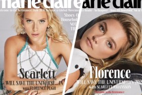
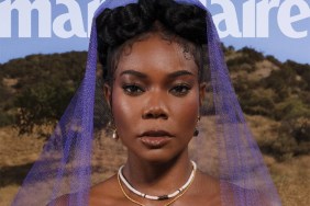
IMAGES: MARIECLAIRE.COM
Check out some more images and drop us a comment here.


