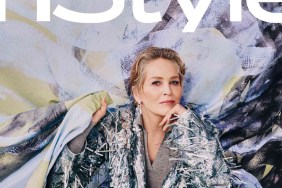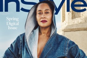
IMAGE: INSTYLE.COM
As soon as InStyle‘s latest offering surfaced, forum members began to tell it like it is. “She doesn’t look her best here, I’m afraid the dress is awful. As a fuller figure woman it’s doing her no favors. Also, can InStyle lose that awful floral masthead sash? Leave that tackiness for the German edition,” replied Benn98.
“That dress is hideous,” jal718 disapproved.
MON wasn’t feeling it either and said, “That InStyle cover looks like a Kleenex tissue box. All tea no shade. Happy for her cover tho,” he noted.
Also unwilling to show enthusiasm was LastNight: “Mindy looks great, very pretty here and I like her pose and outfit. The masthead is a disaster, that purple texture matching the pattern on the dress along with the green font is not appealing.”
In agreement over the colors of the fonts was RanThe. “Mindy Kaling looks amazing and looks like herself on the cover. Don’t like the green text. It’s overkill,” he commented.
Join the conversation inside our dedicated InStyle worldwide thread here.


