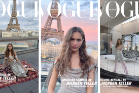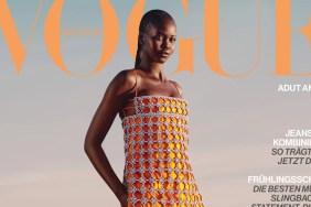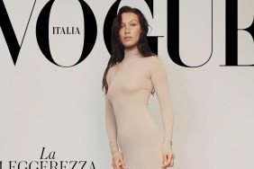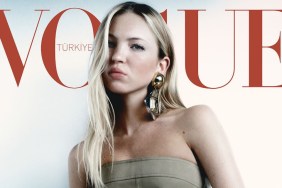
IMAGE: FACEBOOK.COM/VOGUETURKIYE
Not quite, it seems. “A rather strong shot ruined by an awful layout. I thought the Anniversary issue showed improvement but I guess it’s still the same,” noted MON, failing to hit us off on a high note.
Forum member kokobombon wasn’t feeling it, either. “I don’t like this, the color scheme is not appealing imo. Poor Catherine, two April covers and both of them are not good,” she exclaimed.
Also not sold was narcyza, who wasn’t afraid to comment, “Everything is wrong here: makeup, styling and awful colors.” Oh, dear.
“Beautiful photo but too much text. Why? Especially that white font, really horrible. But still I like it,” added Housseyin.
Changing the mood dramatically with a totally different view was justaguy. “Always happy to see Cat and she looks great here!!” he enthused.
Forum member |PerfectTonight| shared the same positive attitude. “I strongly support creative vision of Vogue Turkey. Always delivering strong covers.”
Could we have seen something more compelling? Add your own two cents inside the thread here.


