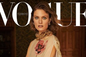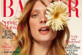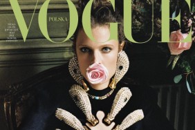
As usual on our forums, members have diverse opinions regarding the cover. “Constance is lovely but something about the hand placement makes her look like a glamorous migraine sufferer,” comments Luxx.
“Looks just a bit unfinished. Something’s just not working here. Still, kudos to them for not using all those texts,” wrote Srdjan.
Creative made a pretty strong statement: “Ugly cover. They chose the worst picture. I literally CAN’T with this magazine anymore. I’m done.”
Then on the other hand, some members were satisfied with the cover. “Go Constance! Happy she got another Vogue!” enthused la veronika.
“How stunning, this will look even better in print I think,” shared Miss Dalloway.
Be sure to check out the accompanying cover story and the rest of the issue’s contents within the thread here.


