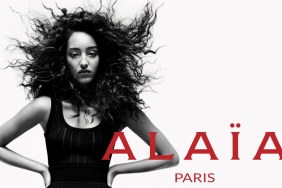
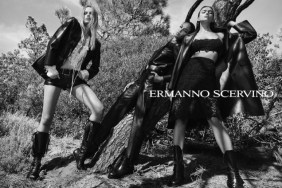
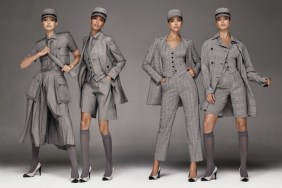
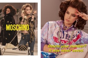
“It’s quite powerful and beautiful,” hfgl described.
“This campaign looks spectacular,” fashionlover2001 posted. “The clothes look amazing on Joan and just pop out. Her poses are a hit and her face looks flawless.”

Legolas wrote: “I looove the composition of each ad, the lighting and everything regarding art direction is perfect… Joan’s poses are awesome and easy, she really is one of the best posers in the industry because she always makes the clothes look appealing, but I would have liked more diversity in her expressions. Looking at all of the images together, as a whole campaign, makes them appear redundant … but each of them work very well separately, and that’s what really matters at the end.”
Legolas has a point about the redundant facial expression, but when it’s such a good face does it really matter? He was able to overlook the repetition, and so am I. I love how simple and striking each image is, and despite being in black and white, Joan makes the clothes come alive.

Images: vogue.co.uk


