A GIF of JLaw’s June 2011 Flare cover first surfaced on Tumblr, where it was subsequently picked up by numerous blogs. It shows Lawrence pre- and post-Photoshopping, with the finalized to-print cover version showing her neck more elongated, her eyes pulled further apart, her collarbone lowered, her cheekbones sunken in, her hair thickened, her chin chiseled down, and even her freakin’ fingers made slimmer! I mean, she’s perfect already and it’s so unnecessarily needless. What were they thinking?

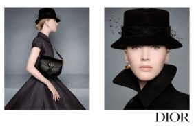
Yes, it’s an old cover, and yes, we’ve seen this happen to a lot of actresses, but what’s ironic in this case is that Jennifer Lawrence is one of the most outspoken stars when it comes to peeling back the celebrity image. She previously criticized her Dior ad campaign, commenting to Access Hollywood about the photos, “That doesn’t look like me at all. I love Photoshop more than anything in the world. Of course it’s Photoshop, people don’t look like that.”

Lawrence also told Yahoo! CEO Marissa Meyer in November, “The world has this idea that if you don’t look like an airbrushed perfect model. You have to see past it. You look how you look, you have to be comfortable. What are you going to do? Be hungry every single day to make other people happy? That’s just dumb.” Do you think she knew about Flare’s computer whizz trickery and, if not, what would her reaction be?
The Rogers-owned publication has yet to comment on the issue, but I would love to hear them explain their reason for removing JLaw’s trademark moles. Is nothing sacred?! Now excuse me while I try to dislodge my collarbone to Flare’s acceptable standard.
Image via Tumblr/Flare


