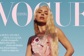
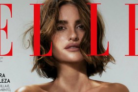
We all know Penélope Cruz photographs like an absolute dream, so how did Vogue Spain manage to mess up her December cover shoot? The Spanish title has had plenty of hits and misses this year, churning out some of its most compelling covers ever at the beginning of 2016 followed by a bit of a rough patch over the past couple of months. For the latest cover, the ever-gorgeous Penélope poses for Mario Testino, wearing Agent Provocateur lingerie and a Burberry coat worn over one shoulder.

IMAGE: VOGUE.ES
Members of our forums were beyond unimpressed with the results. “The lighting makes her looks sick IMO, like jaundice! I like the styling but the hair and makeup could have been better,” said kokobombon upon seeing the cover.
Also not a fan of Testino’s lighting was Wintergreen, acknowledging, “The lighting is terrible.”
“Eh, rather flat. She’s such a stunning woman and photographs like a dream, they could’ve done much better than this,” echoed a disappointed Marc10.
In agreement over how terrible the cover turned out was tigerrouge. “I like the idea, but where’s the life? Testino’s work used to show celebrities as glamorous and glowing, as if the sun shone from their skin. This feels very flat – yet we know she’s gorgeous, and no stranger to posing for magazine shoots, so where did it go wrong?” she asked.
“It would’ve been a very interesting cover but I hate this layout, color of the background and those fonts,” narcyza disapproved.
“It’s OK. I can’t say it’s bad but at the same time it’s not amazing,” admitted liaa.
Yet not everyone felt let down by Spanish Vogue. “Fantastic!!! Wow!!! It looks like Mert Alas & Marcus Piggott’s photography,” pointed out john2elmajor.
TeeVanity felt the same way, raving, “Love this, great December cover!”
https://www.youtube.com/watch?v=IlCFxuwbcBQ
Do you feel as though the cover could’ve been better, or are you an immediate fan? Join our discussion here.


