IMAGES: NYTIMES.COM
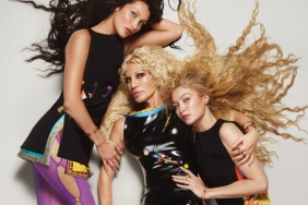
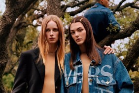
Our forum members certainly weren’t afraid to voice their dismay. “This is the worst Versace campaign in years… It looks like Dolce & Gabbana,” cried Aizanara immediately.
“This does not work. There is no glamour, no allure, no Versace. Logo could be switched out for Coach or Dolce & Gabbana in the outdoor shots,” added a disapproving VogueDisciple93.
In agreement over how terrible the campaign seemed to have turned out was Vitamine W: “Ouch, this looks like a Ralph Lauren editorial from an in-flight magazine…”
Forum member sixtdaily wasn’t buying Donatella Versace’s new vision, either. “This is so bad! Is Karlie supposed to be sexy in that second shot? And Gigi as a mom just doesn’t work. This is the level of a commercial catalog, not Versace!” she declared.
“What happened to the sex appeal?” asked a dumbfounded marsnoop2.
“Wow I hate to say it but this is really bad. I’m not sold by the concept at all; it looks more like a catalog than a proper campaign,” said GreyVetiver, echoing everyone else’s sentiments.
But not everyone was left so disinterested. “Huge plot change. Bombshell style sex appeal as the weapon is indeed something that’s fading these days. I appreciate this new woman image they try to present here,” reasoned Pricciao.

IMAGE: NYTIMES.COM
Are you a fan of the change? See more of the campaign and join the debate here.


