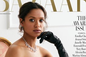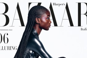
IMAGES: HARPERSBAZAAR.CO.UK, MAGSHOP.COM.AU
Which edition took home the trophy, you ask? “Reprint but still so gorgeous, I don’t mind. Better than U.K.,” declared KateTheGreatest upon first look.
“I much prefer this version!! Something looks different, more intense colouring perhaps? All that white space on the British edition is not to my taste,” raved an equally impressed Benn98.
Also quick to show the Australian version some love was MON: “Now this is how you do it Harper’s Bazaar U.K.! This is stunning!”
A.D.C. echoed the same sentiments: “This just proves the Aussies know how to make good covers! There must be something in the water over there. Just a few tweaks and they turned this into a stunner. It’s almost like they saw the U.K. cover and were like, ‘Step aside and let us show you how it’s done!'”
“Loving the close-up and the simplicity of the styling,” approved justaguy, in complete agreement with everyone else.
“Wow. It’s amazing. Love it,” complimented narcyza.
Are you in agreement? Show some praise and join the conversation here.


