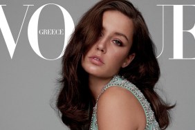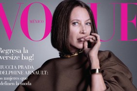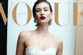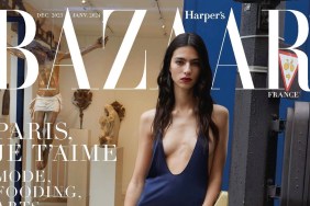
IMAGE: VOGUE.FR
“She looks…like the crab (Sebastian) from The Little Mermaid. Testino GO HOME,” ranted Creative the moment the cover surfaced on our forums.
Benn98 was quick to respond, “In tepid Gucci? It’s certainly not a bad shot of her, but it’s unremarkable for a fashion magazine. I’m surprised they passed on Léa for Charlotte, who already had a cover.”
Also not showing much support was Cosmic Voices who exclaimed, “The fact that she has no neck and that her head looks superimposed on the most awkward of angles has truly disturbed my vision.”
“Whoa, such a stunning girl, and yet they managed to make her look not her best self. Fashion magazine covers are in such a weird place the moment, imo. I can’t remember the last time I was blown away by a cover, or an issue!” added an underwhelmed Miss Dalloway.
Sharing the same sentiments was LizzieF: “I love Charlotte! I thought this could not go wrong. But it is really bad. Shame, beautiful girl but horrible photo/styling/makeup.”
KateTheGreatest wasn’t feeling the outcome either and echoed, “I don’t like her at all, but that aside, the cover itself still doesn’t work for me. I don’t like the angle and I want Vogue to be more daring, more out there, special, amazing, something…not a girl in jeans.”
A missed opportunity for Vogue Paris? Give us your own two cents here.


