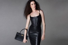
IMAGE: NYTIMES.COM VIA TFS FORUMS
Like a moth to a flame, our forum members were quick to give us their opinions on the first campaign images. “Lame,I wish it was in color. It would be nice to see the colorful crystal mesh dresses and skirts in color,” noted VersaceVixen009.
“Simply unappealing. I don’t even know what else to add…” commented an almost speechless MyNameIs.
“The worst campaign for Versace with Madonna, too much Photoshop and the facial expression looks so strange,” proclaimed testinofan.
Another forum member not feeling it was Benn98, who expressed, “Such a stunning collection, don’t know why Madonna had to front it! Anna or Lara would have been way better for this. I was hoping for color.”
“I guess it makes it easier to Photoshop and retouch in black and white?” questioned khyrk.
Flashbang changed the mood of the thread entirely when he posted, “I’m glad that Donatella chose her. She can make those clothes [come] alive waaay better than most working models right now.”
“Slaying like I knew she would, and for the fourth time,” shared a more than satisfied mepps.
Are you a fan of Madonna’s fourth Versace advertising campaign? Check out some more shots inside the thread and share your opinion with us here.


