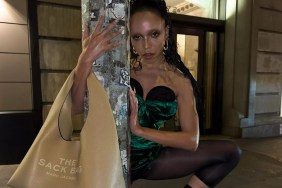
“This picture is creeping me out. Not looking forward to seeing it in magazines and having a mini heart attack every time those two girls stare at me from the pages,” wrote TheItGirl.
kewkaw noted that the image looked “like a Scary Pajama Ad” and Cold found that “it looks like a teen depression campaign. Edie is really getting her sad on.”
“This is so bad I actually like it,” laughed jmrmartinho.
Melancholybaby admitted, “With all these elements I should hate it, but it is strangely attractive. Eager to see more.”
It is always hard to judge an entire campaign from just one preview, but I am certainly eager to see more of the campaign as well. If only to see if other shots might be less frightening and hopefully focus a little more on the collection itself rather than the unconventional look of the featured models.

Image Credits: @thelovemagazine instagram and marcjacobs.com


